
Chapter 02 — DADDY JO · Brand, packaging & commerce
DADDY JO
The brief
Build a magazine that happens to sell skincare — and make the taste itself the product.
DADDY JO is an editorial retail brand: house-formulated skincare and fragrance sitting inside a curated catalogue of things worth owning. Not a Shopify beauty store with a blog bolted on. The premise is inverted — the writing, the rituals and the point of view come first, and the commerce resolves quietly underneath. I own the brand, and I designed and built all of it.
01 — Origin
Building someone else's brand
It began as recommendations. No products, no inventory, no storefront — just an anonymous account with a point of view, posting what was actually worth owning. La Prairie. Sisley. Tom Ford. Armani. La Roche-Posay. The picks worked, which was the problem.
Every good recommendation was equity handed to somebody else. The trust was being built here and spent there. FLESH exists because of that arithmetic: if the taste is the asset, the taste should have something of its own to sell. The curator didn't stop curating — it just stopped doing it for free.
The plan on paper put owned product in Phase 3, years out, after an affiliate business had earned its way there. That queue got skipped. House formulation came first, the catalogue assembled around it, editorial as the frame — funded out of pocket and built at night rather than waiting for a cheque that was never going to arrive.
The result is a brand operating as two things at once: a curator publishing picks it earns nothing from unless you trust it, and a house shipping product under its own name. The whole design problem is making those read as one voice instead of a conflict of interest.
02 — Spatial design
Ground up,
not palace down
Same house. Different order of construction. The first DADDY JO was drawn as a shop, a place you walk into — and none of that thinking was wasted, it just got built from the ground rather than down from the palace.
Three tiers, rooted in gay male culture. A flagship shop with a full experiential floor, a serpentine gallery and a lounge. A membership resort with accommodations and weekly programming. And Jo, a two-to-four-hundred square foot express format for highway and nightlife sites — the cheap way to prove an idea before committing to the expensive version of it.
The envelope was specified before anything could be leased. Matte black sooty facade, chrome only. Mirrored floor-to-ceiling glass, so the street is implicated before you've stepped inside. An etched logo, never backlit — backlighting asks for attention, etching makes you come closer. Cast-iron Amsterdam bollards. A dark floral cart at the entry, because the first thing you meet should be alive.
Underfoot, black on black so it only catches at the right angle, a carpet reading WHO IS DADDY JO? — the question the brand is built to keep asking, and the one line that survived every pivot since, all the way onto the storefront that exists today.
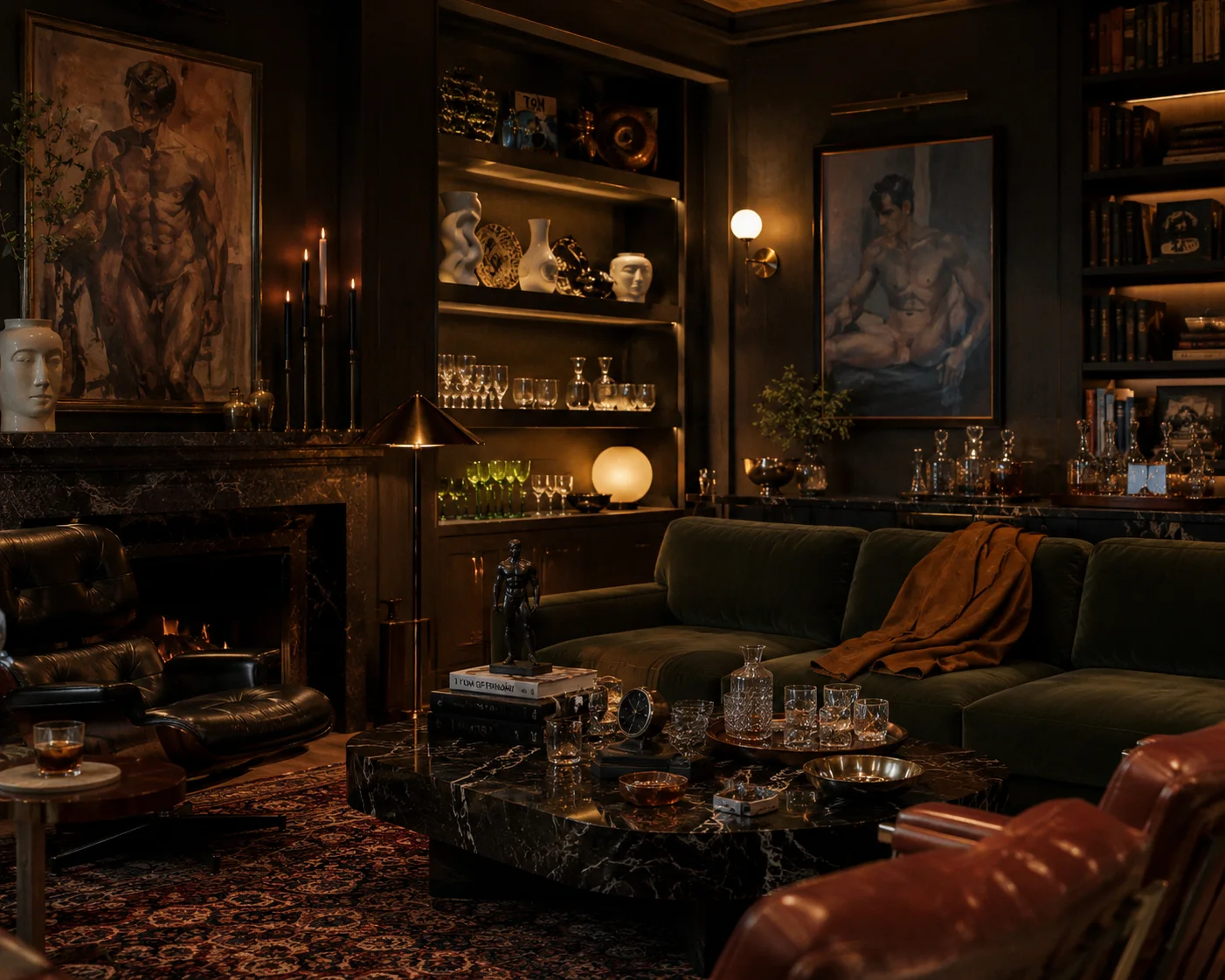
Inside, the room was designed as an instrument rather than a container. Programmable LED volume walls so the whole space could be re-scened without re-fitting it. Scent diffused by zone, so moving through the floor is a sequence of rooms rather than one continuous smell. The gallery's plan curved into a shape the brand was never going to be able to unsee — so rather than straighten it out, it got kept.
Retail was demo-first. Gear worn on forms instead of hung on racks. Testers at the counter. Fixtures you could get into rather than look at behind glass. You understand what you're buying because you've held it — closer to a good bookshop than to conventional retail, and that was the point. The positioning triangulated grocery-aisle warmth, leather-bar credibility and resort hospitality.
Leading with a building means spending everything before you learn anything — every decision locked in drywall before a single customer has told you whether they want it. The digital business inverts that: the same brand, the same rules, but every assumption gets tested by someone actually paying before it gets built in a material you can't take back.
So the storefront is the ground floor, not a substitute for the house. Scent zoning becomes a ritual. The programmable wall becomes a template that re-scenes weekly. Demo-first becomes editorial — you understand what you're buying because somebody who's held it wrote it down. Paused, not abandoned.
03 — Voice
Who is Daddy Jo?
The brand speaks through a persona — faceless by rule. A man about town, a gay oracle, warm rather than salesy. He doesn't sell, he vouches: "Taste is the product." He is never depicted and never identifiable, no model shows a face, and the founder stays out of the frame entirely. Every line on the site is his, not mine, and keeping that separation clean is most of the art direction.
The customer isn't looking to be taught taste. He wants confirmation and a shortcut past the noise from someone who has already done the work — which is why the entry price sits low enough to be a repeat buy and the aspirational upsell only works once that trust is already paid for.
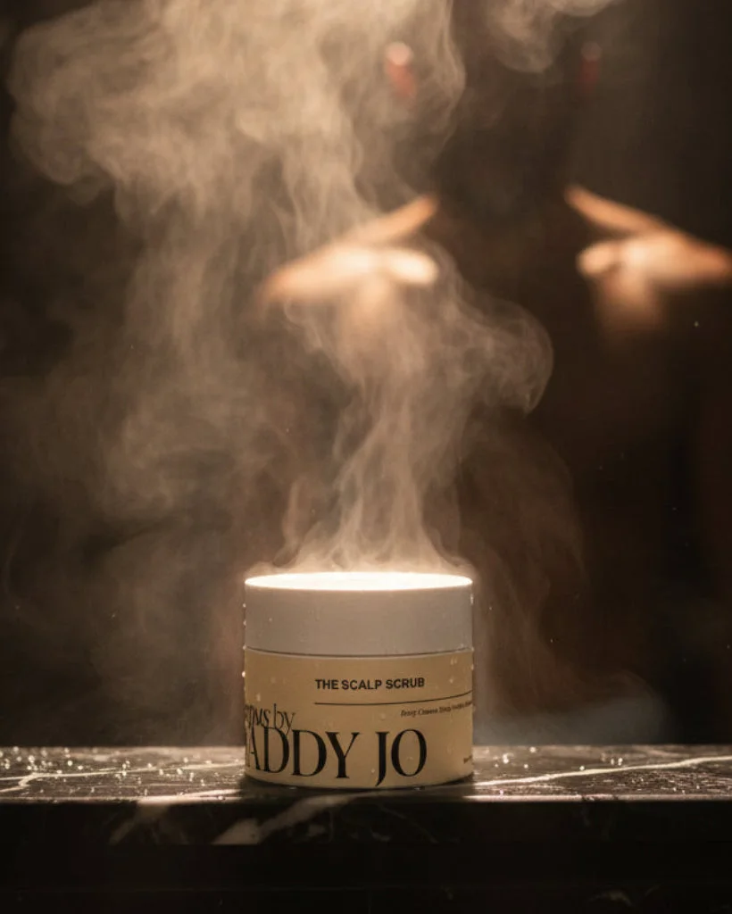
The visual system is locked and largely defined by what it refuses. Hard directional light, deep shadow, real specular skin with the pores left in. Marble and architecture. Cropped and fragmented — a shoulder, a jaw, a hand — over conventional portraits. Banned outright: bathroom scenes, men smiling while holding bottles, towels, shaving clichés, gym imagery, blue backgrounds.
The test it has to pass: it should read as a fashion publication that happens to be about skincare, not a skincare brand trying to look like fashion. The House page states the standard plainly — skincare is chemistry before it is branding, read the INCI and not the marketing — and closes on the only rule that governs the catalogue: "If we wouldn't want it ourselves, it doesn't wear the Daddy Jo name." A persona is only worth building if it can be told no.

04 — The system
The Curator Engine
The architectural core, not a feature. Products are many-to-many with narrative groupings, so one item can live inside several Collections and several Rituals at once. A Ritual is the flagship unit: four products, one playlist, one photograph, a set of fragrance notes, and a piece of writing — assembled into a single narrative and sold as one thing.
Leather Night is what Daddy wears when the night has plans of its own — $659 for the full ritual. Ash Hour is the opposite register, recovery with nobody grading it, at $167. Same structure, same page template, completely different mood. The format is fixed. Everything poured into it moves.
That is the whole trick, and it is the same one I have been running since the Amazon campaigns: fix what can't move, let the rest change. A ritual is a container with a locked shape. It can hold a $500 house parfum and a $26 candle without either looking out of place, because the structure — not the price, not the vendor — is what makes them read as belonging together.
It is also what makes the catalogue survivable. Editorial stays hand-picked; I refuse to auto-fill it. But the engine means a merchandising decision is a content decision, made in the CMS by rearranging references, with no deploy and no developer.
Since launch the engine has grown a second unit. A journal piece is now shoppable in place — an editorial or a how-to where the products sit inside the writing rather than alongside it, and nothing asks you to leave the page to buy. That is merchandising space which did not exist before: educational and unhurried at the top, product-forward by the end, and the article never stops being an article in order to become a store.
It carries what the house doesn't make, too. A Find is its own document type and deliberately not a product — it belongs to 1stDibs or Mr Porter or Gucci, can't be priced live and can't go in a bag, so the system photographs it, credits it and points at it. Daddy doesn't chase trends is the proof: a whole room assembled out of other people's objects, with the affiliate arrangement said out loud instead of buried.



05 — Packaging
The house lines
FLESH is the performance line, formulated with Selfnamed. The name was the whole argument — SKIN was clinical and wrong, FLESH was visceral and right. Everything under it is named for mythology rather than function: HELIOS, SOMNUS, PHOENIX, AEGIS, JUVENTAS, ELIXIR. Collection boxes follow the same law — AURORA, ELYSIUM, EQUINOX, THE TRINITY.
CORPUS is the body and grooming half, and it deliberately breaks FLESH's rule. Where FLESH names every product for a god, Corpus names nothing: The Wash, The Serum, The Cream, The Oil, The Scalp Scrub — with "Corpus by Daddy Jo" as the credit line underneath. Two systems, one house, because the body half earns its authority by sounding plain. Its copy makes the quieter case: "this is the part of the routine no one photographs."
SIGMA is the house fragrance — Tuscan leather, tobacco, birch tar, animalic. Matte black bottle, gold drip emboss, and a line that tells you exactly which brand you're holding: a wound dripping with opulence. SILVA, a moss soy candle, sits alongside it.
One rule governs all of it. The name does the arguing. Oblique beats clinical. And nothing gets announced as live until it actually is — a naming system is only a system if it can refuse things.
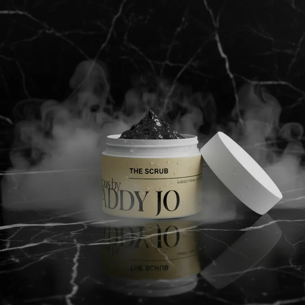

Every label is built on the same grid: the product name largest, the line credit beneath it, the function in one line, volume at the foot. Minimal ink, no gradient, no radius. The invariant again — one label system across every line, no bespoke layouts, so a new product is a content decision rather than a design project.
Only the ground changes. Black marble under CORPUS, black leather under the serum, shattered glass under SIGMA. The surface does the work a model would normally do — which is how a line with nobody in it still reads as a campaign rather than a catalogue.

06 — The build
Headless, and it has to feel like it
Next.js 16 and Tailwind 4 on Vercel. Sanity is the content hub — products, rituals, collections, journal, house content, campaigns, homepage modules, all cross-referenced. Shopify is the commerce engine and nothing else: inventory, payment, fulfilment. Every pixel a customer sees is the front end.
The split matters. Sanity holds the editorial layer of a product — how it is written about, which rituals it belongs to, what it sits beside. Shopify resolves the same product at purchase, by handle. Editorial can be rewritten all day without touching commerce, and the catalogue can change without touching the writing.
The catalogue is far larger than it looks from the front page, spread across dozens of vendors and still growing, most of it dropship, with the house lines pinned above it. Motion is Framer Motion with GSAP reserved for the hero — slow fades, luxury easing, no carousels and no spinners.
SEO was built as a layer rather than an afterthought and deliberately gated until launch: structured data, canonicals, sitemap and metadata discipline across every content type. Search Console flagged a live indexing problem after launch; that triggered a full audit and a round of production fixes rather than a shrug.
House lines
0
FLESH, CORPUS and the fragrance — owned product, not affiliate.
01 / 03
Faces shown
0
Nobody is depicted. Not the models, not the founder. That is the rule.
02 / 03
Outside investment
0
Funded out of pocket. Built by the person who wrote the scope.
03 / 03
Role
Founder, Creative Director and Designer. Brand and voice, packaging system, editorial direction, photography direction, the Curator Engine content model, front-end build, and the SEO layer. Formulation by Selfnamed.
Honest status
Live and indexed. FLESH and the fragrance are shipping; CORPUS is rolling out in pieces rather than launched whole. Almost none of it is warehoused here — the catalogue is dropship and made-on-demand behind a house-built editorial layer. The vouching is real; the loading dock isn't mine. The persona speaks on the site. I don't.